an interactive visualisation of a curated collection of music for user engagement.
Project
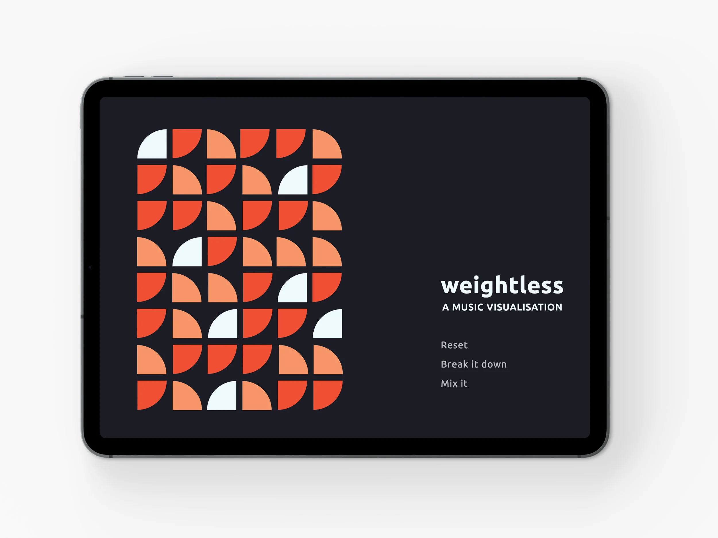
Weightless - A Music Visualisation
Institution
California State University, Chico.
Duration
14 weeks
With music having become so accessible and our music libraries so content heavy, this project curates a collection of music and presents it through a dynamic music visualiser that facilitates an unintimidating and clear user experience. This music visualiser is highly interactive with functions allowing users to refine, analyse and view the accompanying data. The interface has been completely coded primarily using the Javascript library D3, as well as HTML and CSS.
project brief
This project required a collection of 50 songs to be organised into a dynamic music visualiser that would provide a clear, concise and visually pleasing user experience. Both qualitative and quantitative data of the songs, such as their tempo or duration, were to be collected and systematically presented. Interactivity was also important with the user needing to be able to sort the data based on what interested them. The music visualiser would be coded using the javascript library D3, HTML and CSS.
background
Current technology has dramatically shifted how we engage with music. Subscription-based applications such as Spotify and Apple Music have made music increasingly accessible and give users much more freedom compared to when songs or CDs needed to be individually purchased. While this is a significant development it also has the potential to become overwhelming with users building vast libraries. This project provides a way to experience music in a more concise, guided manner.
strategy
With clarity of information at the forefront of this project, my strategy revolved around developing a consistent visual system that would allow a clear user experience. This would be achieved through the careful and purposeful designation of meaning through assigned colours, and varying scale, orientations and transparencies.
process
research phase
The project began with research looking at how information can be visually condensed into abstract representations. I also paid a lot of attention to curating a playlist that carried a distinct tone. The final playlist, Weightless, was a collection of gentle to upbeat songs with an electronic leniency. I chose the songs for their strong beat as these would be more interesting when animated.
collating phase
With the playlist together I collated all the relevant data for each song such as the artist, album, release date, duration, and tempo. This data was sorted in Excel and then converted into code.
visual phase
With all the elements together, I undertook a visual exploration of how I could represent this collection of music. This involved thumbnailing concepts and then creating digital mockups. I experimented with using different geometric shapes and exploring how far the shape could be pushed in the system. I also considered what associations I could draw from the music theme, such as lines for concert strobe lights or circular forms for records. I settled on my strongest concept and created a non-interactive prototype for each page of the interface.
Digital concepts for design direction.
execution phase
Using my prototype as a guide I moved into coding the visualiser, this primarily involved the Javascript library D3, as well as HTML and CSS. I began with getting the base elements down for each page and then progressed into adding interactivity and animations. I also had to consider my sorting features and how the visualiser responded to different elements. The coding was the most challenging part of the project as I was unfamiliar with D3. However, with lots of experimentation and research into the D3 libraries, I was able to achieve more than my initial prototype expected.
design solution
The final outcome was a very satisfying one. It presents a curated collection of music in a visually pleasing and dynamic way that is clear for users to engage with and find songs they enjoy. With the beat being primary within the electronic genre I focused a lot of the features around tempo. Tempo is also a good set of data to use to differentiate moods, such as slower tempos for a laid-back mood and faster tempos for an energetic tone. This can be seen in the ‘Mix It’ function which sorts songs by tempo or duration, the ‘Break it Down’ function which shows the percentage of high, medium and low tempos, and the assigned colour and orientation for the different tempos. The music visualiser has a clear system with the quarter circle shape remaining central to each page, as well as having a consistent colour scheme, typography and grid in place. Together, these elements created a strong and cohesive aesthetic.
software used
Brackets - with Javascript, D3 Libraries, CSS & HTML
Adobe Illustrator
Adobe InDesign